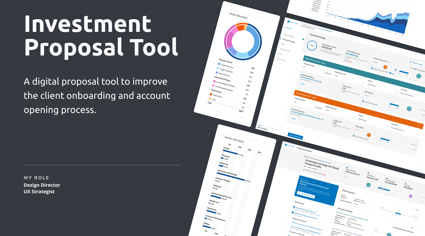
Investment Proposal Tool
Advisor Proposal Generator
Project
Replace the legacy proposal tool with a state-of-the-art proposal creator built on a new technology stack and leveraging Envestnet’s API layer.
Solution
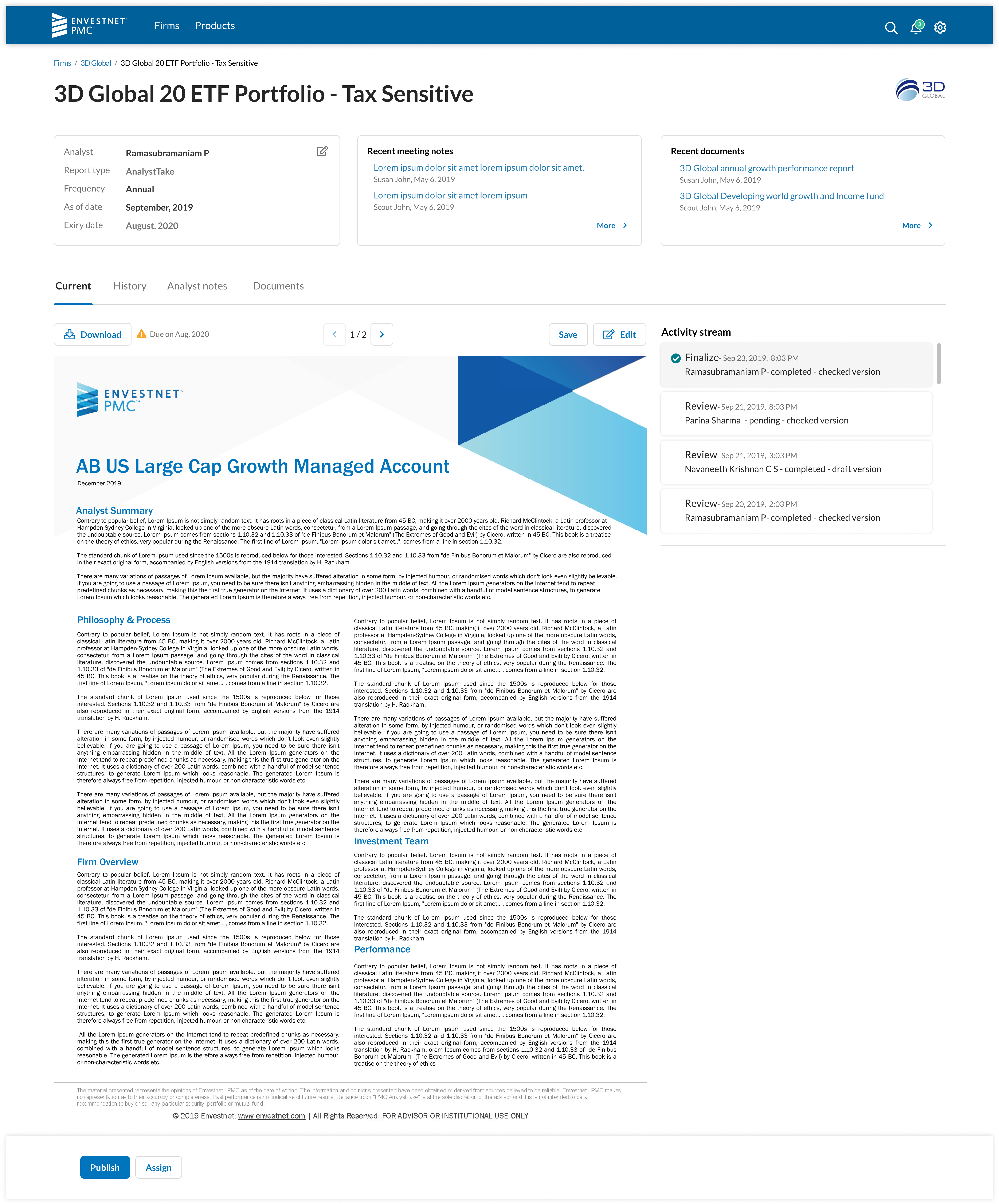
The proposal project was the first where we used the design system matched with a React UI layer and utilizing responsive data loads through our API layer. For the MVP version, we focused on a simple stepped flow recognizing that a proposal does not get created in a single session and often involves back and forth between and advisor and client.
Project \ Investment Proposal Tool
Overview
Target Users \ Financial Advisors
When designing a Wealth Management platform for Financial Advisors there are 3 things to keep top op mind:
1. This is an aging and shrinking user group.
According to various studies and publications, the average age of financial advisors is somewhere between 51 and 55 years, with 38% expecting to retire in the next 10-years. They often do have assistants that complete so of their tasks.
2. They have a growing book of business with more accounts to manage and the profit margins is getting slimmer.
Because the margins are getting tighter, and advisor cannot afford to turn down any investments, no matter how small. But every account, no matter how small, requires some resources to manage. The most precious resource of an advisor is their time. In the design process we focused on trimming all unnecessary task, to increase overall efficiency of onboarding an account.
3. They use multiple tools to complete their day-to-day task.
The swivel desk problem is very real for this user group. There is a growing frustration for these users as they constantly must relearn their software. Our goal was to componentize as much of our sub-task and reuse these same interactions in other parts of our suite of tools.

Setting Default Values
The legacy platform set default values in a programmatical format without letting the user able change it. This caused a lot of frustration for users, when they had to find records for subsequent taks.
In the very first step we prefilled these values and allowed the user to change them. They can also easily add additional family members, something that they had to do in a separate system in the legacy platform.

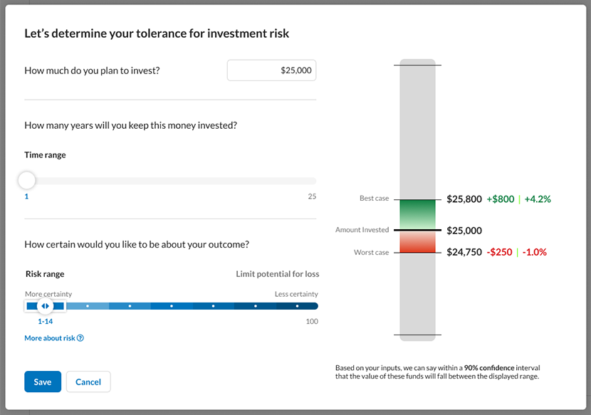
Adding Interactive Components
A critical step for an Advisor is to determine a client's investment suitability. Typically, this is done through a risk tolerance questionnaire. Our goal was to create an interactive visualization to clearly show the upside (more certainty) and downside (less certainty) of investments.
Through a simple set of controls a user can see their potential outcomes.
Complex Account Strategy
Data and interviews showed that about 80% of uses case follow a very simple pattern. In the legacy tool user still had to follow the long path. Our goal was to ensure that the tool remain simple enough that these users can achieve success along the shortest route.
On the other hand, it also needed to accommodate the remaining 20% of complex account strategies. These often involve opening multiple accounts with different registrations and different investment vehicles and, as such, represent a large portion of an advisor’s assets under management.

Picking the Right Investment
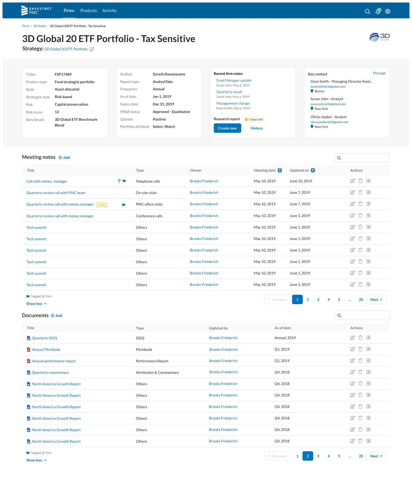
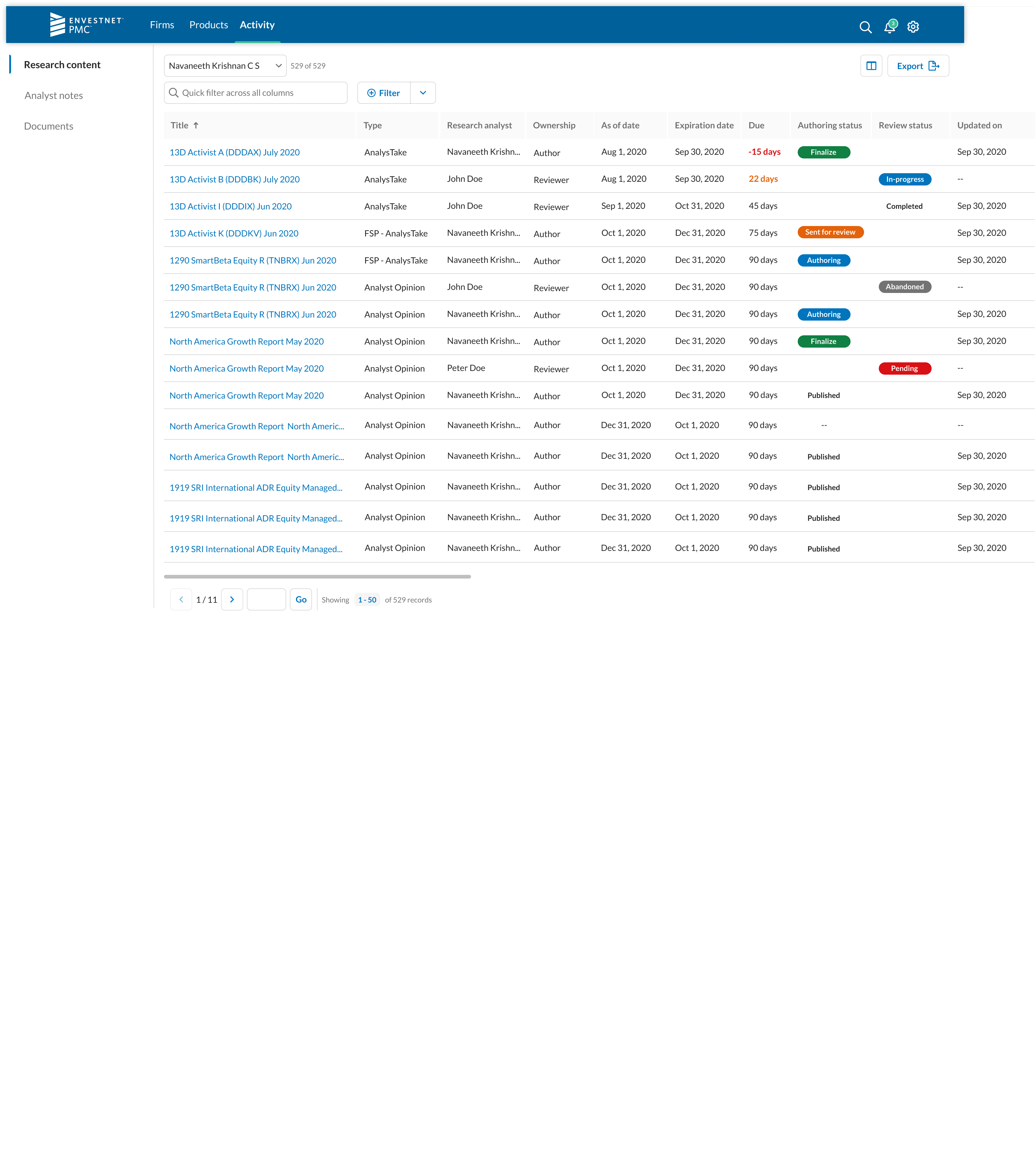
While most advisors focus on a shortlist of pre-picked and often pre-approved investments, the more sophisticated advisor will want to delve into the nuts and bolts of the investments to ensure they meet their clients’ needs.
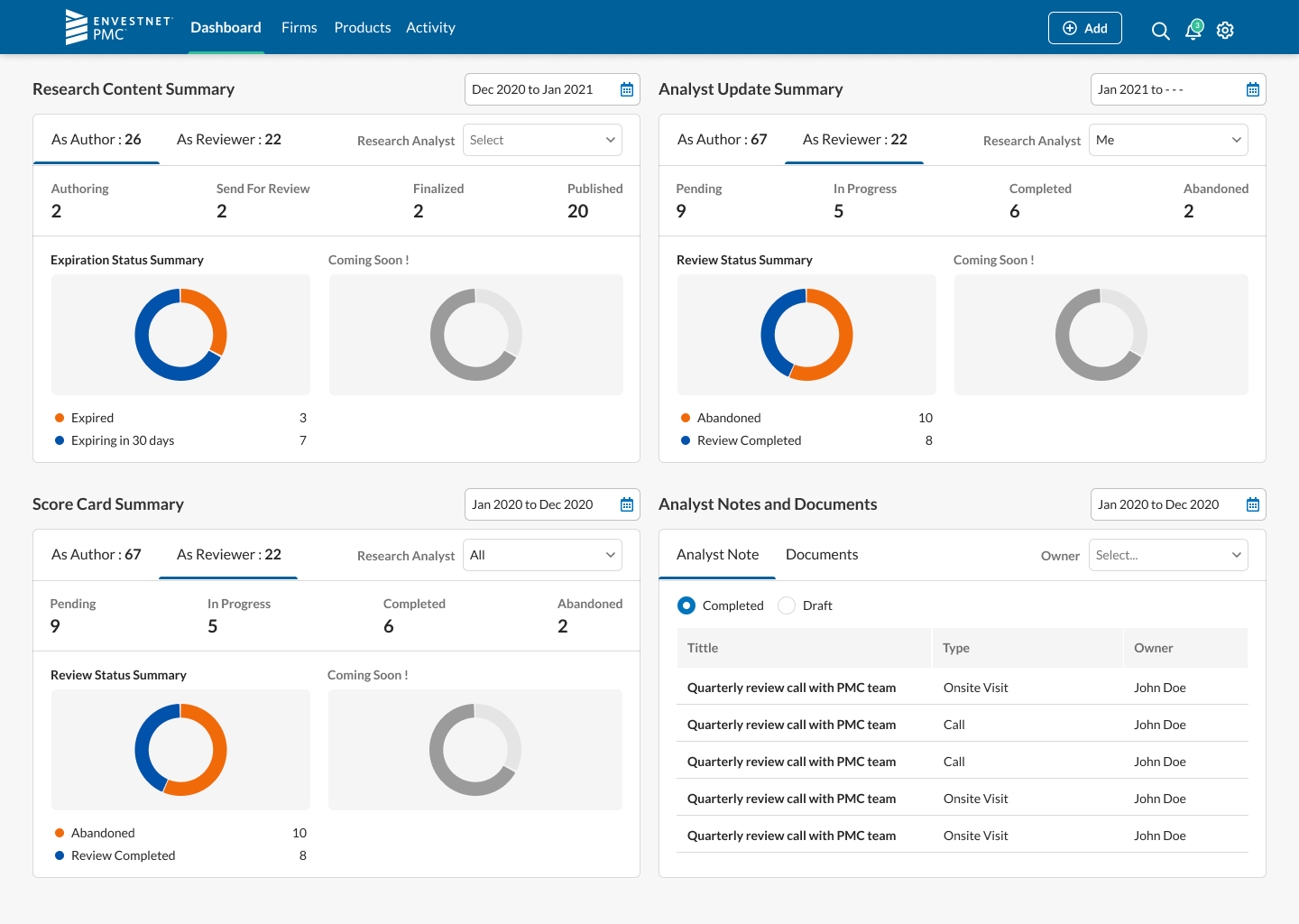
The designs system documents a new set of standards for all data visualizations. Our goal was to bring transparency and accessibility to all data representations.
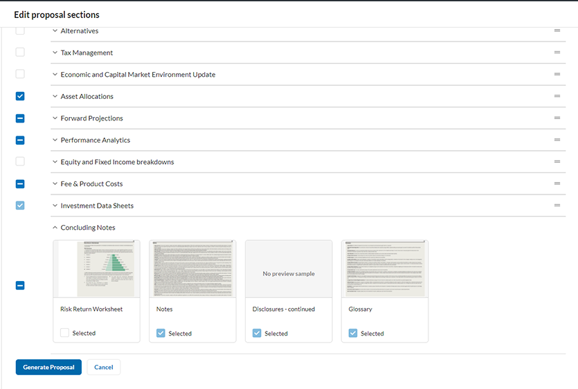
Personalized Content
A typical proposal tool produces a “pitch” document that an Advisor will use to discuss a proposed investment with their client. And a typical Advisor prints the document and then remove most of it. We set out to change this behavior. First of we let them customize the content and add their own. Then we let them save these as templates, so they do not have to do the customization over and over. Lastly, we enable them to send the document electronically to an online destination where their clients can retrieve. This would also become their client’s future online portal to review their investments.
Crossing the T's and Dotting the I's
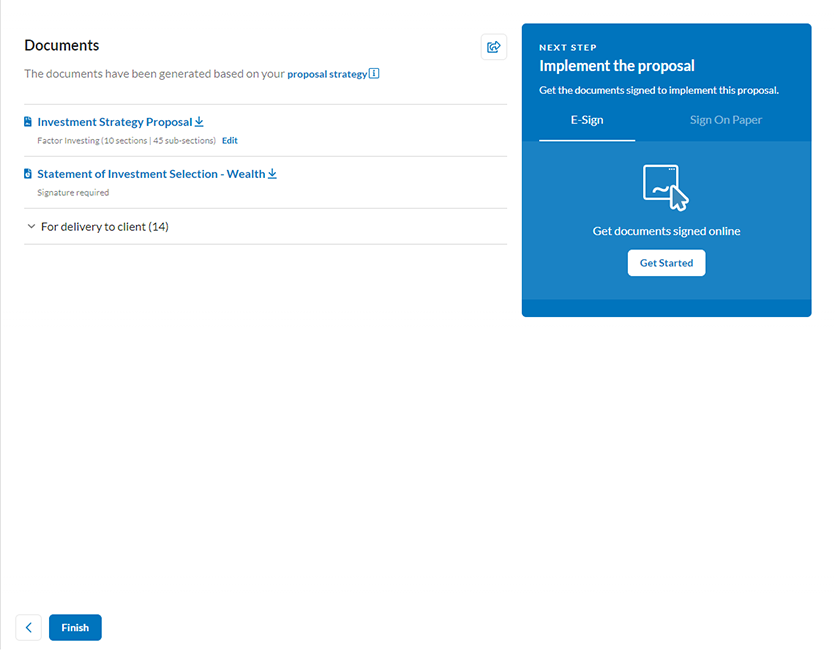
The conclusion of the proposal journey is the opening of the account. This is often where most time goes to waste. We integrated a with DocuSign to enable an E-Sign process to speed up the account opening. While this is a great improvement, financial institutions are slow to change. We also improved the process to retrieve wet signatures and repost signed documents to the system.
Through a back-end configuration, institutions can now easily switch from the offline mechanism to the digital one.
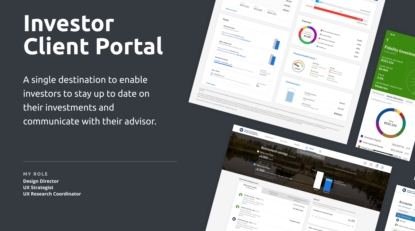
Investor Client Portal
Online Advisor Client Platform
Project
Create a platform for advisor clients where they can aggregate all their financial information, audit their managed accounts, and share documentation securely with their advisor. This is a B2B2C platform.
Solution
This was the 3rd version of this product. The previous versions failed to garner significant adoption. During the design process I contracted with an agency to conduct usability testing of the prototype and we incorporated the feedback during our design process. This version had a 50% higher adoption rate.
Project \ Investor Client Portal
Overview
Target Users \ Clients of Financial Advisors (B2B2C)
When I joined Envestnet they were in the process of redesigning their client portal experience. While not far into the project it was clear that they were not hitting all the marks. We also did not have a design system in place. I set out to reset the process.
We started with a couple stakeholder meetings and a 2-day workshop to review the work done, but more importantly to set clear goals for what we wanted to accomplish.
1. Advisor clients needed to be able to review their managed investments.
A user should be able to log in and see the most up to date investment statements and not have to rely on monthly or quarterly snail mail deliveries.
2. It was to be a primary point of contact between the advisor and their clients.
Clients should be able to upload documents for review by their advisor and in turn receive communications and documentation from their advisor. By the end of the project, we also enable a screen/video-on-demand system to facilitate in person communication.
3. Financial planning clients should be able to aggregate all outside account data into the portal.
Financial planning is only as good as the holistic picture and advisor have of their client’s financial life. We enabled the Yodlee account aggregation module to meet this need.

Workshop
I have always been a proponent of pulling in as many stakeholder in our design session as possible. You facilitate cohension and ownership, that pays off in the long run.
We spend 2 days in our head office in Chicago to review all existing products and document our goals for this product.

Nothing Beats Research
The client portal's intended user base is the general public. When we screened for user for our research study we did skew to folks with investable assets.
Our biggest concern was with the account aggregation module. User are expected to select their financial institution, then enter their username and password to establish a connection between the portal and institution. They could then choose what data the advisor would see. We thought that older users would be hesitant to do this and millenials open to it. But we found the exact opposite. Our youngers test users was very cautitous.

All Data in One View
The best advice comes from a position of knowledge. The client portal allow users to see what service their advisor is providing them. In return by aggregating all their financial data in our place, their advisor can help them plan the financial futures.

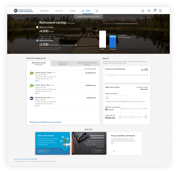
Planning is the Key
The days where financial advisor are brokers/stock pickers are long gone. Clients expect a relationship with their advisor. They want to discuss their futures with their advisor and plan long and short terms goals.
This tool allowed client's to setup goals, play around with it, and then pass it over to the financial advisor to help them facilitate real outcomes.
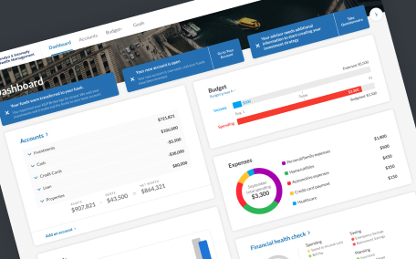
Actionable Dashboard
Our research indicated that most users wont acces the portal often, the average user would probably log in once a month. Keeping that in mind we made the dashboard very actionable: a quick overview of all data with highly visable and animated notifications that required immediate action from the user.

Promotional Video
Advisor Client Portal \ Promotional Video
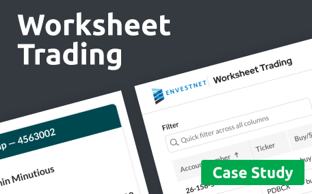
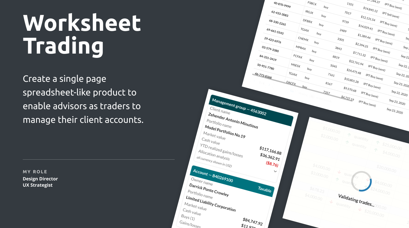
Worksheet Trading Platform
Spreadsheet-like platform
Project
Create a single page spreadsheet-like product to enable advisors as traders to manage their client accounts.
Solution
Our focus was on respecting existing user patterns when utilizing spreadsheet applications. Clients would typically download information into a spreadsheet, manipulate it and then upload the data. We replaced this flow and enhanced it with validation and real-time calculations on decision-making information.
Project \ Worksheet Trading
Overview
Target Users \ Advisors as Portfolio Managers
Advisors as traders is a very niche market within Wealth Management. A small number of the institutions we served have cornered this market. The trade specifically with accounts and models in mind, rather than a sole focus on a particular security. Most users in the space uses Excel spreadsheet to figure out what and how much the need to trade on a specific account. Once the have done their spreadsheet tasks they will log into system where they will then set up each trade. Only at that point can the validate trades against real-time data and investment policies.
We set out to create a tool that would mimic the functionality of a spreadsheet but provide the user with all validation in real-time. They can then stage their trades before pushing it to the trade ordering and monitoring platform.
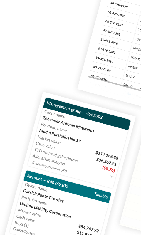
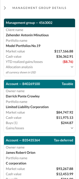
Summary Information
While an advisor might be focused on a specific account, that account might be part of a large management group that needs to be considered as well. Our design system includes an optional right-hand floating panel, specifically for instances like this. The user can easily expand or collapse it when they need more of the spreadsheet viewport available.
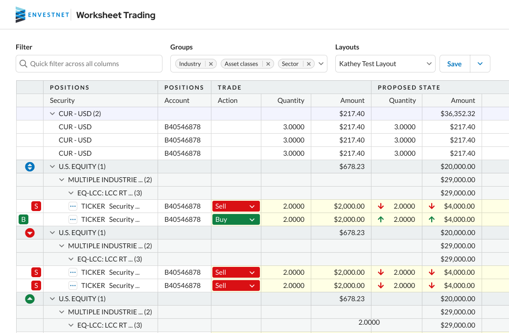
The Devil is in the Detail
We used a 3rd party plugin (engineering decision) to build out the grid. From an experience point of view this was problematic. The plugin had all the bell and whistles to help the user really get lost. From our interviews with users, we knew that they only needed and certain set of features and I had to walk our engineering partners through the rational of why we need this customization.
Using bold colors, we were able to clearly indicate to users what the results of their actions were.
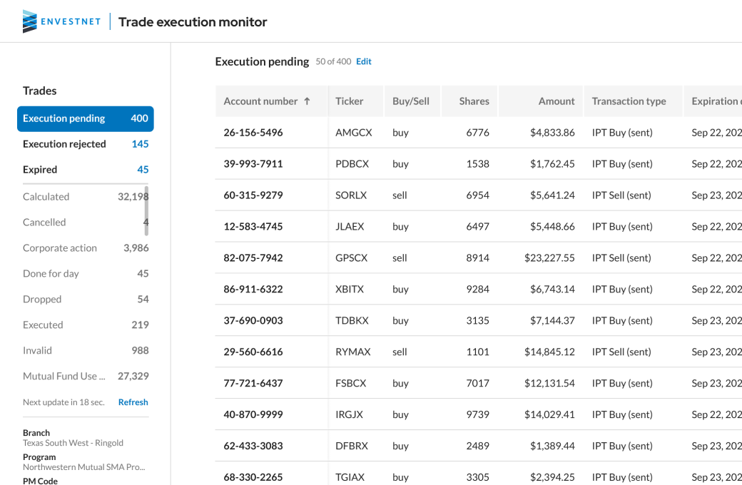
Monitoring
The latest add-on feature was to bring trade monitoring into the experience. In the legacy platform it was unnecessary cumbersome to keep tabs on which trades have cleared and which needed follow-up.
With a simple interface, some basic filtering, and a simple API we were able to push this solution out within 2 weeks.